在 Chart.js 中制作直方图直方图、Chart、js
We use the Chart.js library in our codebase and I need to create a histogram, which is not one of their default chart types. So I'm attempting to override the x-axis tick marks on a bar chart so that they appear at the left and right corners of each bar instead of directly underneath.
In the below example I've gotten the x-axis how I want it by adding an extra item in the labels array and displaying a second x-axis in the options. But, because there's now an extra label, the bars are taking up 4/5ths of the width, leaving space for a non-existent data point.
Is there some way that I can specify to ignore the missing data point? Or offset the bars? Or am I barking up the wrong tree?
The documentation is a little hard to parse through, so I'm not sure if there's something simple I'm missing.
var ctx = document.getElementById("myChart").getContext('2d');
var myChart = new Chart(ctx, {
  type: 'bar',
  data: {
    labels: [0, 1, 2, 3, 4],
    datasets: [{
      label: 'Group A',
      data: [12, 19, 3, 5],
      backgroundColor: 'rgba(255, 99, 132, 1)',
    }]
  },
  options: {
    scales: {
      xAxes: [{
        display: false,
        barPercentage: 1.30,
      }, {
        display: true,
      }],
      yAxes: [{
        ticks: {
          beginAtZero:true
        }
      }]
    }
  }
});
canvas { max-width: 200px; }
<script src="https://cdnjs.cloudflare.com/ajax/libs/Chart.js/2.7.2/Chart.min.js"></script>
<canvas id="myChart" width="20" height="20"></canvas>
Edit: I realize there are other libraries that could achieve something similar and I am looking into other options. But, I've posted this just in case someone out there knows of a solution via Chart.js, which would be ideal.
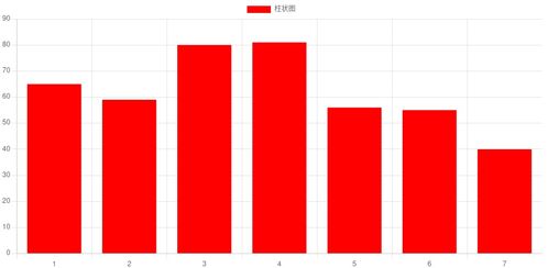
Here's an example of what the end result I'm going for is:
解决方案I believe you can get the result you want by using the max parameter on the ticks configuration of the x axes.
By using 2 different x axes with different maximums you can label the bars differently from how they're drawn. Resulting in labeling the marks in between the bars without drawing an extra "empty" bar.
var ctx = document.getElementById("myChart").getContext('2d');
var dataValues = [12, 19, 3, 5];
var dataLabels = [0, 1, 2, 3, 4];
var myChart = new Chart(ctx, {
  type: 'bar',
  data: {
    labels: dataLabels,
    datasets: [{
      label: 'Group A',
      data: dataValues,
      backgroundColor: 'rgba(255, 99, 132, 1)',
    }]
  },
  options: {
    scales: {
      xAxes: [{
        display: false,
        barPercentage: 1.3,
        ticks: {
            max: 3,
        }
     }, {
        display: true,
        ticks: {
            autoSkip: false,
            max: 4,
        }
      }],
      yAxes: [{
        ticks: {
          beginAtZero:true
        }
      }]
    }
  }
});
canvas { max-width: 200px; }
<script src="https://cdnjs.cloudflare.com/ajax/libs/Chart.js/2.7.2/Chart.min.js"></script>
<canvas id="myChart" width="20" height="20"></canvas>